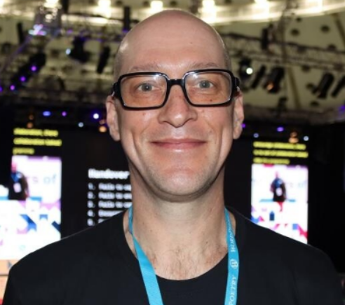
In this LMScast episode, Christiaan Pieterse shares his journey and importance of Maxi Blocks. With stunning templates from Maxi Blocks, you can build websites more quickly.
Christiaan Pieterse is Co-Founder of Maxi blocks. It’s a page builder and template library. Maxi Blocks helps to add amazing templates to your website and with the help of page builder , there is a option to modify those templates.
He and his wife overcame the difficulties of remote web design work over time, finally switching to a white-label web design strategy. They streamlined the process by serving as in-house web designers for other companies in this model.
Maxi Blocks is subsequently created as a response to further simplify web design, providing users with a library of patterns, blocks, and icons to personalize and construct full websites.
Maxi Blocks, which are built on top of Gutenberg, offer building blocks that may be joined to create patterns, which in turn comprise full web pages, improving accessibility and effectiveness.
Here’s Where To Go Next…
Get the Course Creator Starter Kit to help you (or your client) create, launch, and scale a high-value online learning website.
Also visit the creators of the LMScast podcast over at LifterLMS, the world’s leading most customizable learning management system software for WordPress. Create courses, coaching programs, online schools, and more with LifterLMS.
Browse more recent episodes of the LMScast podcast here or explore the entire back catalog since 2014.
And be sure to subscribe to get new podcast episodes delivered to your inbox every week.
2025 WordPress LMS Buyer’s Guide
Exclusive Download! Stop wasting time and money researching online course and membership site tech.
Episode Transcript
Chris Badgett: You’ve come to the right place if you’re looking to create, launch, and scale a high value online training program. I’m your guide, Chris Badgett. I’m the co-founder of LifterLMS, the most powerful learning management system for WordPress State of the end, I’ve got something special for you. Enjoy the show.
Hello and welcome back to another episode of L M S Cast. Today I’m joined by a special guest. His name is Christian Peters from Maxi Blocks. That’s it maxi blocks. com maxi blocks is a page builder. It’s a template library. It’s super cool. I’ve got members on my team raving about it. I’m really excited to chat with you today.
Welcome to the show, Christian.
Christiaan Pieterse: Thank you. Happy to be here.
Chris Badgett: So how do you describe maxi blocks to somebody? What is it?
Christiaan Pieterse: I would say it’s first and foremost, a template library. So a fully functional web design template library. And then secondly, a page builder, which you can use to customize those templates with
Chris Badgett: Awesome. And tell us why you decided to make it. I mean, there’s, there’s page builders and the starter sites and all kinds of stuff out there. What. What inspired you to go to all the work to create this beautiful design template library in MaxiBlock?
Christiaan Pieterse: We’ve been doing web design for a long time. So my wife started as a, she’s my co founder as well.
She started web design in 1998. When she started out, it was all HTML and Dreamweaver. I mean, the websites were so basic at the time. It was a huge amount of work anyway. So she has a lot of experience working in agencies and working with customers. So in, this was in 2012, we made the decision to start a small little web design agency while we were in Asia and.
At the time, we identified WordPress as being a good solution because doing an HTML site at the time was impossible for people to update. And if you, if you’re working remote you, you can’t always get to help people update their sites. And it was a thing. So we had to enable people to be able to update their websites.
So we identified WordPress. This was in 2011, and we started working with that and then built websites that way. We slowly progressed up. I’m giving you a long story now, but it, it lays the foundation of, of where I’m coming to. Then we started serving customers remote. For web design specifically and eventually what we found was it was extremely time consuming to get find the customer in the first place.
Then you have to train them on how to. Do a website, how it works, how to hand it over, all the basic things with design and working remote and sitemaps and all of that other stuff was difficult for people at that time. So we decided what can we do to make it easier that we don’t have to keep training our customers.
To do the web design projects. And then we thought why don’t we do white label web design, where we act as other people’s in house web designers. In that case, we work with an experienced salesperson inside of that company who knows how the systems and the processes work. They have their customer, they know us, they know what’s necessary.
And that’s how it developed from there. We then built up a client place over a period of time until about 2015. And that’s when Divvy came on the scene for us. We started looking into Divvy specifically because we made so many sites. We were a small team at the time we built about 60 websites in one year.
For a small team of five and it was a lot of science. I mean, we were so tired and exhausted. I mean, we, we just, we just couldn’t cope. So we, we were thinking, how can we simplify it to be able to reuse existing things that we do and just to modify it. And that’s when we identified that. And the main thing that they innovated was the ability to export sections and layouts and reuse them elsewhere.
That was like, that was a big thing. I mean, there was no other service at the time that could do this. So we were like, okay, that’s our thing. So we started, we literally overnight we switched to, to using Divi. And then we started developing sites for customers and that went really well and smoothly.
And it was so challenging to to deal with customers. It takes a huge amount of time to deal with customers and making sure they’re happy and doing the handovers, doing reviews and all of those processes. So we thought to ourselves, is there some way that we can make a transition to a membership model or to have products also at the time, one of the changes that happened for our white label with design pitch was Previously it was O Desk.
I don’t know O Lance. E Lance and
O Desk. And they got bought up and then they turned into Upwork. But when those guys came on the scene O Desk. They were advertising fully functional websites for $250. Now this was remote and we were out there trying to sell, you know, $1,500 website or $3,000 websites here. All of a sudden, SSK is advertising $250 websites, and I think they damage the market in a big way, especially for people that work remote.
And there’s a. There’s a, there’s a point where a customer, they’re not willing to pay you more unless they can see you in person, they can walk into your office and go, Okay, I know you, I see you, I trust you, and I can you. So that happened, that market change, and then we were like, it’s the, we couldn’t go lower because we couldn’t afford it.
We couldn’t go higher because we, we didn’t want to do customer facing. So we were stuck between a rock and a hard place. And then we thought, Hey, why don’t we make templates for these 250 web designers out there? Because they don’t necessarily have the experience. And we had a lot of customers come back to us and say, Oh, I used Odesk and Elance and it was a nightmare.
Please fix it for me. And so we thought, Okay, let’s make, let’s make templates for them. And that’s what we did. We made the switch on. We started designing templates. And so previously for Kyra, it was Kyra being the designer she always had a creative brief to be able to make a design. And now when you’re designing templates.
There’s no creative. So it was in the beginning, it was extremely difficult for her to, you have to guess what you’re trying to design or you pick a niche or a template or a homepage or, you know, like a thematic relation. And then you have to design something that works roughly for everybody.
Anyway, we progressed onwards. That business that we have is still going. And that’s been going since 2018. Over the time we’ve built 2000, almost 2600 patterns and pages that’s available through a plugin that you install and then a cloud template library. You subscribe to the template library and then you click on it, you download the item, and We updated.
We maintain it. So all you have to do is install it, download it and use it on. That’s how we made the switch to getting into him. Wow, that’s very cool. Long story, but I think it gives context.
Chris Badgett: It does help. And I’m looking on on the template library right now, and there’s 15, 157 items that people can pick from, which is amazing.
Can you describe? The difference between a page and a pattern for somebody if they’re not if they’re not used to
Christiaan Pieterse: patterns. Sure. The, the template library you’re looking at now is our new MaxiBlox template library. The one I was just explaining for the 2500 was in the previous niche in Dewey, which is still operational.
In 2020, we made the decision. Okay, we have to do our own thing. One of the one of the challenges we had in support in dealing with customers, we’ve had over 20, 000 support conversations of customers using patterns, layouts, templates and the things they struggle with. And we paid very close attention to those things to reduce our support, and we started MaxiBlox to try and deal with those specific issues.
So getting to that was first when we started with Gutenberg. Gutenberg as the, as the base blocks that were there in 2020, we just couldn’t build the designs that we knew we could make. And eventually we were just like, okay, we have to start building our own blocks and our own stuff to, to actually build something that’s, that we know that we can build with CSS and animations and responsive and all the other stuff that goes with it.
So we started doing that and then. Coming back to the Denver library that we have now, first we had to build the product, the builder and the blocks in order to make the library to prove that the library works and in order to have a library to launch with at the time we launched the product. So it took us two and a half years to build the product, in which process we were constantly designing the patterns and having different ideas.
To get it all together. So it was a very close development process between the designer, the library guys building the patterns and the developers giving them all the necessary tools to be able to build it. So getting back to patterns, blocks, you have to have those are the core Gutenberg blocks.
These are the foundational elements that come together in order to build a pattern. You, you combine those pieces. In a group arrangement that will make a pattern and a pattern comes together to make a complete page. So a pattern could be a hero, it could be a testimonial, it could be a menu, etc. And that’s how they fit together.
So the 15, 000, the number at the moment, we’ve got 1, 600 patterns. And the 15, 000 are the icons that Kyra drew single handedly over the course of three years. In SVG format, so they’re really small, they’re completely adaptable and scalable. What happened was, she, she did some research, because we’ve been in web design for a long time.
So she did a little bit of research, and she asked herself, what are the basic things that every website needs? If we’re going to make a template library, we have to include the basics that everyone struggles with, or that everyone needs. And this is one of the common problems we found in support as well, is that people struggle finding the right icons.
They either have to install the script or the the style isn’t right, or they spend days and days and hours trying to find the right icons and they don’t fit, or they’re not right, or they’re not the right size or the right format, or they don’t have the software program just to change the color, or they can’t change the full or the outline or the background.
There’s so many permutations that you can think of. And then Kyra said I’m gonna, I’m gonna design all of these icons so that we solve that problem for people completely. So she went ahead and over the last three years, she’s designed 13, 411 icons. That’s
Chris Badgett: amazing. I’m looking at the… Education ones right now, Mitch, I know well, and there’s 117 here.
There’s ideas on how to find ideas here. It’s awesome.
Christiaan Pieterse: Yes. I mean, and she what’s nice about them is they’re not just icons. They can also be. Anywhere on the website as a layer or as a background, even as a hover. If you, if you go to the if you go in the patent library, then you go to, and you just open it myself.
For those
Chris Badgett: of you listening, when you have a second, go to maxi blocks. com and you can see a demo of everything.
Christiaan Pieterse: So if you’re on the template library, maxi blocks. com forward slash demo, you can go to you just. page that opens up for you. If you go down to the team patent, you’ll see we’ve got 226 team patents.
If you continue scrolling down a little bit, you’ll see some examples. I’m trying to find one for you. And everything is searchable, by the way. So for example, let me, if you just type in Thank E. T. M. L. Bro. 46. That’s a tough one. You can, you can actually actually click on it and open it. And once you look at the preview, you’ll see the hover.
So these are fully functional previews. What you look at. This is exactly what you get when you install it on your site or when you install the button. So you’ll see with the hover. It gives you an interesting result. That is actually a shape or an icon, and when you load it onto your page yourself, you can just go in and click and replace it to any shape that you want.
It automatically takes the right color. Of the pattern that is there, we’ll get to the style cards a little bit later. That’s another cool innovation that we have, but that’s the beauty of it. So you never have to struggle to find icons. You can just go into the icon library and search for anything that you want.
Do this one. When you did in the icon library, search for arrows, arrows, search for the word arrow.
Chris Badgett: There’s 528 interface, 121. Yeah.
Christiaan Pieterse: Yeah. That’s a lot. I mean, people need arrows, like there’s so many arrows and, and these, you can use them for buttons. You can use them for, you can overlay them. You can use them anywhere on the side for an arrow, like a down button or a return to top or. There’s so many permutations that you can play with.
And, and the nice thing about the icons is you can set the line width. You can adjust the line width and the fill. All of those things are adjustable. You can change the colors individually or all inside the editing experience of the builder.
Chris Badgett: Amazing. You mentioned style cards. We’re going to get into that.
They look like, they’re like design palettes. Can you explain? What a style card
Christiaan Pieterse: is, how it works? Sure, so a style card is like a skin for your entire website that relates specifically to MaxiBlox. This won’t apply yet. To the other blocks inside of your name on your website that integration we still need to do that’s probably about three, four months away when we can focus on that integration.
The whole full site editing thing is in a lot of flux. It’s moving around quite a bit. Whatever development you do can be replaced quite quickly and you have to update it again. So we have to take it at a, at a pace that we can manage. Anyway, so style cards affect every single maxi block and button in the library.
And the idea behind a style card is that there’s a light tone. And the dark tone for a block or a pattern on that includes everything from headlined text to icon. Colorful line. It’s includes your links, your link, others, your buttons, your button hovers. your backgrounds, your outlines in a light style and in a dark style.
So light tone, dark tone. Now what happens is when you install any of the patterns from the library, you can go into the Styleguard editor. Browse around for the style card that you like and the little thing that you were referring to the little card that you look at is a visual, a quick visual representation of what your patterns are going to look like on the rest of the website once you apply that style card.
So the style card affects roughly 30 different design elements. And all of those have been coded and built in so that when you activate the style card, all the patterns on the page and on the website takes those new styles. And you can go in individually to the style card itself. Save as new and create a new style so you can make an adjustment.
Maybe you want to change the font or you want a different other color or, you know, different H one color and you can make that update, save and apply. You can even export the card if you want to use it later or on a different site. So that’s how the style card works. It’s a quick way to customize templates.
And once you’ve picked your style card and it’s applied, any pattern that you load from the library onto the page automatically takes that style. So it saves you a huge amount of time going through every single item and having to click it and update it. So it’s a page building machine.
Chris Badgett: That’s amazing.
How do you recommend a non designer approach working with MaxiBlox? Should we start with patterns? Should we start with full pages? Like how to what’s the best way for somebody to get over the blank screen and get going and build the website They generally have in their
Christiaan Pieterse: mind. Okay, I would say At the moment, we still busy adding pages.
We we’ve just in the last day or two we merged in development cycle just some missing pieces, which is advanced custom fields. We’ve just merged that in for dynamic content. We also have a repeater field. Sorry, these words might be quite technical for some people but it will allow us to build the pages.
And the point I’m trying to get to is for new people starting out, probably the best way to go is to load a whole page from the library, and then just Start clicking around and update what you want to click. It’s a, it’s a visual editing experience. It’s built on Gutenberg. So we have a custom instance of Gutenberg, and we have our own custom blocks, like many of the other block plugins out there.
And you just install the pattern and then start clicking on the items you want to update. If you want a different style, you can go to style cards, you’ll see a toolbar inside of the editor where you can click on a style card, it loads the library, you click the item, download it, activate it, and then your style is there.
So that would be the simplest way to get started is to just… Load a page and start playing and once you get more familiar with it, then you can go, okay, cool. I’m going to build my
own page. I’m
going to add a header and I’m going to add all of these pieces together, but we find through experience that most people prefer to load a complete page and then remove sections or swap out sections to do what you needed to do. It’s complicated to design a page. If you’re not familiar with it, if it’s new, if it’s new to anyone, it’s a challenge.
I mean, there’s so much knowledge involved in all the things that need to go into this small little page. If you, if you’re not familiar with it, it can be quite a challenge.
Chris Badgett: That’s awesome. You mentioned it before the when you were starting to design all these patterns and pages that it’s hard with the blank screen, how did you overcome that?
With your designer and the design challenge of creating this massive library, how did you decide what to focus on or what components or patterns we needed to make or which pages should we make? Yeah, tell us about your design
Christiaan Pieterse: process there. Yeah, this is, this is Kyra, our designer at Minecraft Founders.
She’s been doing it for so long and also we have the experience from the previous leash with, with Debbie and having already designed 2, 500 patterns and it’s over 500 full page layouts that she’s designed over there. So she had a, she had a good foundation to start with. The thing about Divi is that there’s a limitation in what you can do because you have to fit inside of what Divi is able to provide.
So many times we had to add a lot of additional CSS and coding in order to get a nice hover or a nice background or a nice text animation or, you know, and obviously Divi has improved over time. But this is what we do different in that niche. So taking it the next step is we, we, with Kyra’s experience, she just went through and thought it through.
What do people need? What do people need? And she just… And so we’ve been working through in that process and taking examples from before. One of the challenges that we had was mixing and matching patterns can be a challenge for people. I mean, especially if you have different styles. In our other niche, we have different collections.
And what happens when you want to combine this collection with that collection? And then you put them together and you go, Oh, okay, but the font’s different, or the batting’s not the same, or, you know, the margins are different, or it’s got a different stylistic element, for example. So the, that’s where we came up with the idea of doing style cards.
So that all the patterns in the library can be mixed and matched with each other. And all you have to do to get them to look the same is apply a style card. Wow, that’s really good. Yeah, so we did a lot of coding to, to… I mean, at one point with responsive, we had to go back to the drawing board.
We, we were developing for three months and then we like. Got stuck and we’re like, okay, this isn’t going to work. We have to find a new way to do this. We stopped everything and we rebuild. Our own responsive framework in CSS, and we included Flexbox, and we’ve got six different breakpoints for all the different devices.
We deal with 4K screens. Many websites, when you look at them, they’ll have a 4K, they’ll work on a 4K screen, but the max width of the page is 1, 600 pixels. So there’s a lot of margin on the side that just isn’t dealt with. And that’s the nice thing about our patterns, is that it’s been designed for 4K screens.
It looks really nice on that, too. So all the way through from the biggest screen to the smallest screen, they look nice on those items as well.
Chris Badgett: I’m looking at your headlines, and there’s 60 different patterns. And in my mind, I’m like, okay how many different ways can we do a
Christiaan Pieterse: headline? A lot. Have a look.
And, and I think these are even let me go and click on the patterns as well, because the library is quite big. We spend a lot of time naming, like we’ve got a huge spreadsheet. Every single product is named and labeled before it gets built. Because we knew the library was going to be so big and you need to be able to search for it that we can’t be in a scenario where we named something wrong and you can’t find it or you can’t update it or so this is again from our previous experience.
So we work from a very specific spreadsheet, everything goes in there, it’s decided beforehand and once it’s in, that’s what it’s called.
Chris Badgett: How do you describe the story mix patterns?
Christiaan Pieterse: Those I think probably I would say that’s a combination of icons and headlines and images. I’m trying to think what else in the, in the WordPress library or space would, would be similar.
Look, I would just say it’s, it’s a piece, like it’s a content piece that exists on a page that you create. And that’s. for you to be able to continue to tell your story. It’s, it’s just a name that we came up with that, that described what it’s doing. I like it.
Chris Badgett: It’s yeah, it’s, it’s a new, it instantly made sense to me by the way, when I saw it, I’m like, I just wanted to ask you like how you thought about it.
Cause I think it’s a really cool content type. And a lot of the other ones we’re looking at here, like accordion, call to action, headlines, hero, icon. images. You have 246 options, which is obviously websites are visual. This is a key pattern area to focus
Christiaan Pieterse: on. Yeah. And for for people images can often be a challenge to find the right images.
I mean, I asked our designer the other day. I asked her how much time do you spend when you make a design? How much time do you spend finding images? And she looked at me and she went at least 50 percent of my time is spent finding images, just different frames, different angles. It’s crazy to think how critical the image is as part of the design process.
So that’s why we have so many. Obviously you have them in different configurations. And on that topic, now that we’re talking about images, One other thing that’s nice about our template library is the ability to switch between the light and the dark tone. For example, if you, if you, anyone on the library, when you get to it, if you go to maxiblocks.
com demo and you load, you click on image in the left sidebar and you can click on any of the items there. I’m just going to click on the first one that’s visible. When you click on preview. It will load the item for you, and then you can hover on each of those. It shows you the hover interaction. You can switch between mobile and tablet views.
Those are the actual results that you get when you install it on your page. So this is an exact representation. And then on the top left hand corner, you’ll see the option to switch tone. And pay close attention when you switch the tone, the images change as well. That’s really cool. And because it looks weird when you change the white tone and the dark tone and the image doesn’t change.
It just doesn’t match. So every single pattern in the library that we have has a dark tone and a light tone. And you might ask yourself, okay, so why would you have a light tone and a dark tone? I mean, that’s cool, but you know, how is it useful? So the way that it’s useful is when you build a page let’s say you’re building a homepage.
Often you’ll start with a header or a hero section, you’ll go down with a story mix, you’ll have some testimonials, and so you go through each of those different sections in order to get contrast between them, you will often have a light Tone on the one section and a dark tone on the next section, which gives you the contrast so that when you read down the page or you scan down the page, it’s easy to distinguish between the different sections.
Now what happens is you, you install the template, you’ve got the different tones, and you decide to change the image. of one of the light tones. And the only image you can find is a dark image. Now, all of a sudden, that pattern that you had there, that’s a light pattern, needs to be switched to a dark tone pattern because the image is dark.
Great. You just click on the top there, inside of the editor, you’re able to select the tone, and you just switch the tone, and then it comes to a different color. But now what happens is, all the different sections below it… are all out of sync. You have to go to every single one and change them.
Otherwise, the entire page doesn’t work because you’ve changed the contrast of the one section with maxi blocks. All you do is go through and switch all the times. Obviously, if you have to change the image, you have to change the image, but it saves you a massive amount of time not to have to physically go in and change every single bit.
And inside of the style cards, there’s a light tone variant and a dogone variant in the styles. So when you switch it, it immediately looks right without you having to do the physical work. Wow,
Chris Badgett: that’s, that’s amazing. And not only that, like you’ve also, I mean, a lot of times we’re gonna switch out the image with one of our choosing, right?
We’re usually not gonna leave the one in there. But because your examples are so strong and good, it helps. Someone with less design skills realized like, Oh, I need a dark image. That’s not too cluttered for this thing to really work. That’s a,
Christiaan Pieterse: that’s very good. Can I, can I add something else to that? You’ll also see in the library, not in the demo that you’re looking at, that’s just a live demo, but when you are in the visual editor inside of WordPress and Gutenberg and you’re on the page editor, it’s called the editing experience.
When you are in the editing experience, I forgot my point.
Chris Badgett: What was it about switching images out? Cause I was, I was
Christiaan Pieterse: saying that yes, yes, yes. I remember. Okay, perfect. Thank you. When you are in the editing experience inside of the library pop up, there’s a little check box, which allows you to click the check box.
Which loads placeholder images instead of images into the library. So every pattern in the library can be a wireframe, a fully functional wireframe. You just have to click the button. One, one of the upgrades that we’ll make in, in the future, hopefully in a couple of months is. Along with the ability to switch the tone when you are in the library to view it when you load the pattern, we’re gonna make the ability to load the pattern as a wireframe.
Oh, wow. So you click load as wireframe and it inserts the pattern without the images. So the images don’t. load into the library, but the pattern itself is fully functional with the same hover effects and the same styles. Everything’s there except minus the, this is
Chris Badgett: really cool. You’ve taken basically the complexities of web design and made it more accessible and in many ways, protect.
The website builder from themselves, if they’re not a great designer, like you’re, you’re, you’ve got their back. It’s, it’s really cool. Anything else exciting coming for maxi blocks in the coming years? What, what what’s your vision for the project? I know you already have a great product and, and it’s an awesome tool.
What else was, what’s coming in the future?
Christiaan Pieterse: I would say what the missing piece for us now is the full side editing theme. And there we are busy making the final bits. We’ve just merged the necessary things today. Actually, if you go to the plugin repo, you’ll get the latest version there. If you just go into the repo and search for maxi blocks, it will come up in the WordPress repo.
Anyone who wants to download will we’ve added a repeater field and what we call a context loop. These are the necessary pieces in order to be able to build a blog and make everything dynamic. So the idea, the, the, This is the missing piece that we need in order to take the patterns and complete them into pages and then extending those into a fully functional website that performs like a blog, where you can pull in custom posts and headlines and blog posts and galleries.
All of those things you can then pull in, and I hear the way that we’ve designed it is so that you can take any pattern from the library and turn it into a dynamic pattern or take that pattern and turn it back again into a static back. So that’s we’re trying to make it as flexible as possible. Without, you know, driving ourselves crazy.
If I can put it that way. And you’ll also see the, the items that we’ve run in the library now. If we’re talking about patents specifically. There’s the 16, 000. We started building those in February this year, and we’ve had a lot of stops and starts in between. We’ve had rebuilds. So it goes really fast.
Once you once you learn how to use it and you get familiar with it, if you if you get familiar as a experienced visual builder, then it can go quite quickly. And there’s custom CSS, there’s all kinds of stuff. I recommend anyone just to try it out and see, see how it works. Okay, sorry, I’m going to continue.
Yeah, go ahead. Are we still okay with time? I don’t know. Yeah, we’re totally fine. Yeah. So the theme is the next step. for us. And there’s, there’s one more update that we need to do specifically for speed and being able to take the styles and transfer them down to a block level so that when you use a block as part of a custom field or as part of a template inside of the theme that the styles always.
And that specific block, and that will take us to the next step, then we can do. We already have the theme. It’s already full site editing in able. We just haven’t pulled all the pieces through to make to make all the blocks and all the patterns work inside of the theme and with the style cards.
That’s the next step. So you’re saying you’re saying
Chris Badgett: you’re saying that you’re Phil, you’re launching your own theme. Yes. And it’s doesn’t it’s not out yet.
Christiaan Pieterse: Not at all. We have a theme that’s out already. It’s called the maxi blocks theme. It’s not in the repo yet. Oh, I see. Yes. So the thing about the thing about a theme, at least when we started three years ago a theme, you have to say, okay, I’m using a theme and I’m replacing my site and now I’m using a new theme.
So it works for a certain audience, but for, for another audience, like agencies or developers, as an example they might already have a theme that they prefer to use. And they’ve got all the pieces they’ve got to customize exactly like they want and from that perspective, how would they use our plugin?
Or I mean, how would they use ours? They wouldn’t use our theme. They would want to use it as a plugin. All right, so the plug in gives us much more flexibility to get things done. So we set out building a plug in with the purpose of integrating that plug in with a theme and and full site editing has developed to that point over the last three years that you can put the two together.
So that’s exactly what we’re gonna do is the plug in itself, maxi blocks and then the maxi blocks team and they will play together to Give you everything you’re looking for.
Chris Badgett: That was awesome. Christian, thank you for coming on the show. Maxi blocks looks awesome. I’m looking forward to playing around with it more myself.
Kurt on our team raves about it and yeah, it’s really cool to get into it and learn the story behind it. Any final words for the people? Before we go today?
Christiaan Pieterse: No, I would. Yes, actually, I would say no. I say yes. I have some words for you. Go to the wordpress repo, search for maxi blocks, install it the entire plugin and all the page builder functionality, the blocks all the block functionality, the style cards, everything is free.
There’s over 700 threads. Patterns that you can use. That’s free as well. We don’t restrict anyone so you can build everything yourself. You completely own it, etc. And then what we do is we have a library upsell. which is a pro library component, which you can subscribe to if you want, which then allows you to download and use all the pro patents that are inside of the library.
The beauty about it is that we, we don’t lock you in. So there’s no restrictions on domains. There’s no API keys that you have to install, which is often a pain point for some people. That means you can install the plugin, build whatever you want to build. It’s always free. It will always update. If you want some extra and you want to save some time, you can upgrade to the pro library, install the site.
At the end, you can just sign out of your cloud account and the website over to your customer. And it will always continue working and updating as expected. So just give it a go. That’s
Chris Badgett: awesome. Thank you, Christian. Appreciate that. And thank you for your contribution to the WordPress community.
That’s a lot of value you’re giving away for free and helping people build sites faster, more beautifully. It’s awesome. It’s great to meet you. Thank you for coming on the show.
Christiaan Pieterse: See you next time.
Chris Badgett: And that’s a wrap for this episode of LMS cast. Did you enjoy that episode? Tell your friends and be sure to subscribe so you don’t miss the next episode.
And I’ve got a gift for you over at LifterLMS. Go to Lifterlms. com forward slash gift.
Keep learning, keep taking action, and I’ll see you in the next episode.
2025 WordPress LMS Buyer’s Guide
Exclusive Download! Stop wasting time and money researching online course and membership site tech.

